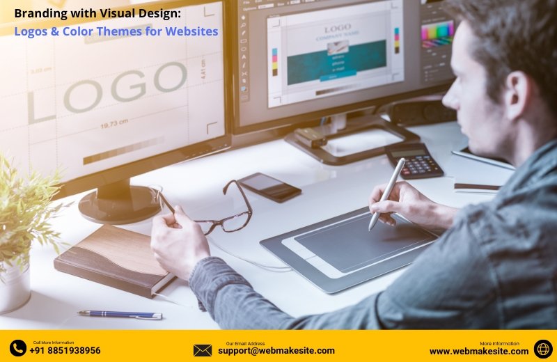
In today’s digital-first world, a website is often the first interaction a customer has with your brand. It acts as a virtual storefront that communicates who you are, what you offer, and why people should trust you. While content and functionality matter, visual design—especially logos and color themes—plays a powerful role in shaping your brand identity online.
Why Visual Branding Matters
Human brains process visuals 60,000 times faster than text. This means your logo, colors, and overall design can create an immediate impression before a visitor even reads a single word on your site. A strong visual identity not only improves brand recognition but also builds trust, credibility, and emotional connection with your audience.
The Role of Logos in Website Branding
Your logo is the face of your business. It is the most recognizable element of your brand, appearing across your website, social media, and marketing materials.
Here’s what makes a logo effective for websites:
-
Simplicity: A clean, minimal design is easier to recognize and scales well on different devices.
-
Relevance: The logo should reflect your industry, values, or brand personality.
-
Scalability: Whether it’s on a small mobile header or a large website banner, the logo must stay sharp and readable.
-
Memorability: A unique design helps customers recall your brand instantly.
For example, think about Apple’s bitten apple or Nike’s swoosh—simple yet iconic. Your website should feature your logo prominently in the header, favicon, and footer to reinforce brand identity consistently.
The Power of Color Themes
Colors influence emotions, behaviors, and decisions. Studies show that 90% of a customer’s first impression of a brand is color-based. On websites, a well-chosen color palette ensures consistency and sets the tone of your brand.
How to Choose the Right Color Theme:
-
Understand Color Psychology
-
Blue: Trust, professionalism (ideal for finance, healthcare, and technology).
-
Red: Energy, excitement (great for food, entertainment, or retail).
-
Green: Growth, nature, freshness (suited for health, wellness, and eco-brands).
-
Black/White: Minimalism, sophistication (luxury and fashion).
-
Limit Your Palette
A website typically uses one primary color, one secondary color, and one or two accent colors. This prevents visual clutter and keeps the brand identity consistent.
-
Ensure Accessibility
High contrast between text and background improves readability and accessibility for all users.
-
Match Branding Across Platforms
Use the same colors in your website, social media graphics, brochures, and ads to create a unified brand presence.
Bringing It All Together: Visual Consistency
When your logo, color theme, typography, and imagery align, they create a cohesive brand experience. Visitors should instantly recognize your brand, no matter where they encounter it. A consistent visual design builds trust, encourages engagement, and increases conversions.
Final Thoughts
A well-designed logo and carefully chosen color theme are not just decorative elements—they are strategic branding tools. They influence how customers perceive your business and whether they decide to engage with you further.
If your website lacks strong branding, it may be time to rethink your design strategy. Investing in professional visual design ensures that your brand not only looks good but also tells the right story to your audience.


 2025-08-28


Comments
Leave Your Comment